

![[PRINCIO x DECOS] – SIMPLICITY CREATES DIFFERENCE](https://princio.com.vn/wp-content/uploads/2024/03/decos-1.png)

[PRINCIO x WATARAI] – EMBRACING INNOVATION
- adminquantri
- 04/20/2023
- 164
Established in 1972, Watarai Electrical Engineering and Construction Company is one of the prominent companies in Northern Japan, specializing in building power grids and supplying electrical energy. With the desire to rejuvenate its brand image, PRINCIO is honored to collaborate with the enterprise on this project.
Given WATARAI’s focus on energy-related products, PRINCIO decided to use lightning bolt imagery to highlight the brand.
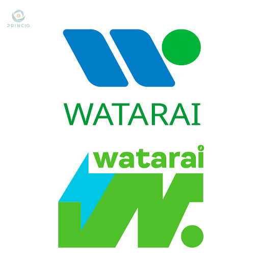
The primary colors chosen are green and navy blue. These two colors align perfectly with WATARAI’s management philosophy: “Honoring through harmony” (with society, employees, supporters). Additionally, green and navy blue represents nature, a crucial aspect that WATARAI emphasizes. For this collaboration, WATARAI opted for two logos with distinct styles.
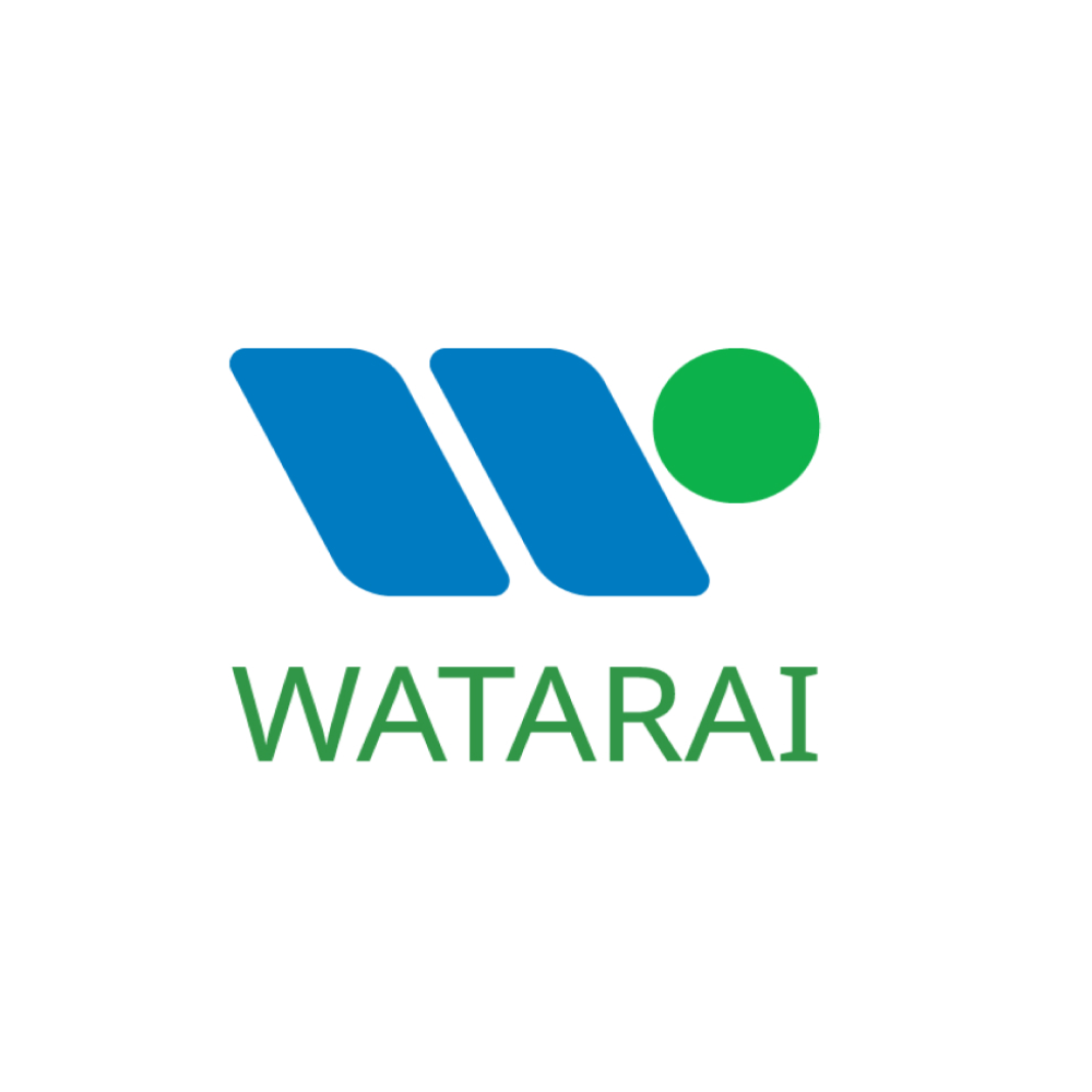
For the first logo, the letter “W” draws inspiration from the company’s name. It serves as a focal point regarding the “electric” aspect for people to remember. This new imagery conveys strength and stability regarding the quality of work that WATARAI can deliver.
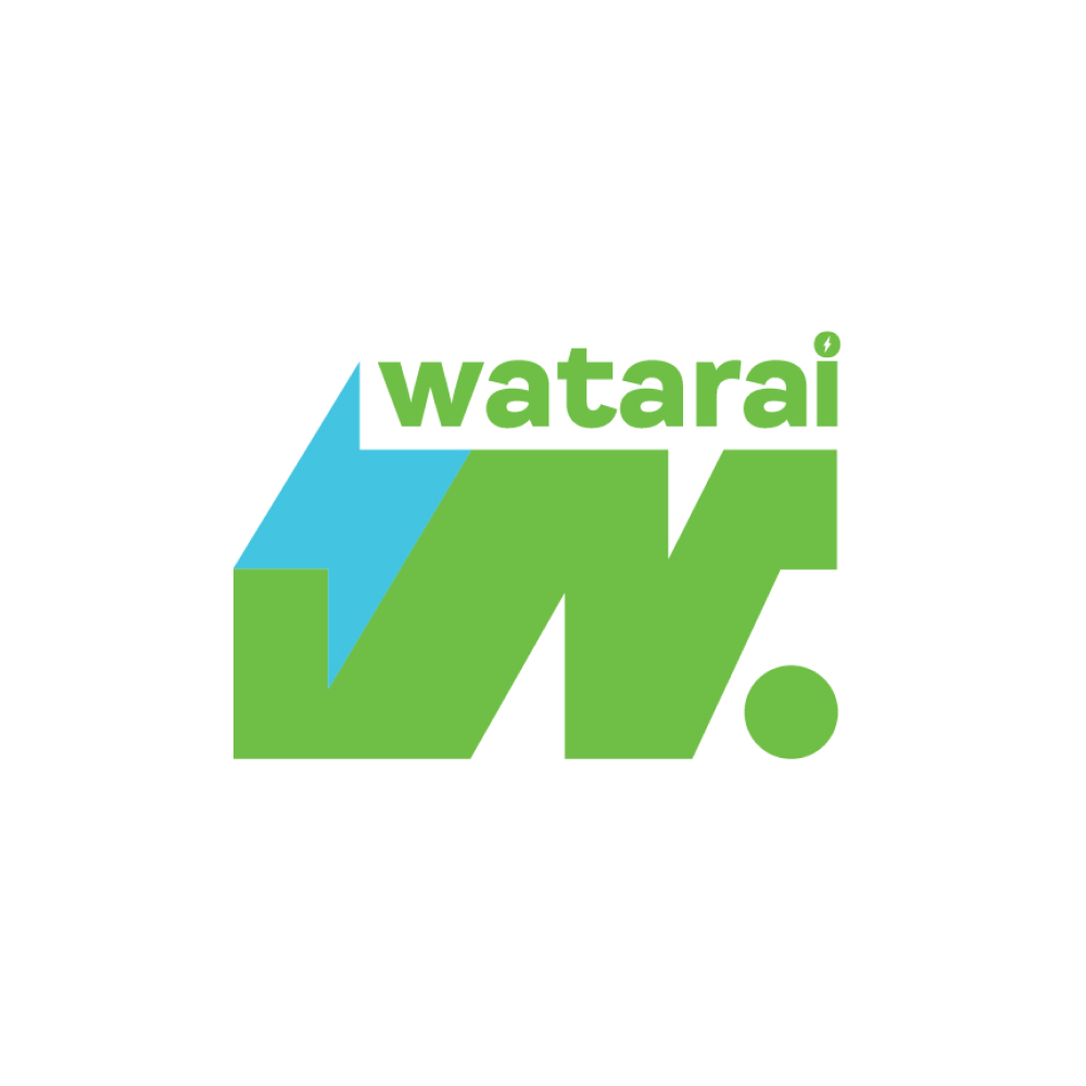
For the second logo, PRINCIO incorporates two elements: waves and energy. Waves symbolize nature and energy, reflecting what WATARAI pursues on the path of development. The circle within the logo represents a breakthrough, coupled with the meaningful waves, signifying everyone collectively leading WATARAI toward a bright future with boundless positive energy.
Thank you, WATARAI, for entrusting PRINCIO with your new brand identity!
PRINCIO has many other unique products in store; stay tuned for more!